I Love Promise
Starting from a couple of speakers on the beach in 2000, Promise has truly morphed into a world class DIY music collective. Bringing world-renowned talent and showcasing local up-and-comers. With events staged throughout the year, Promise is a trendsetting Toronto institution.
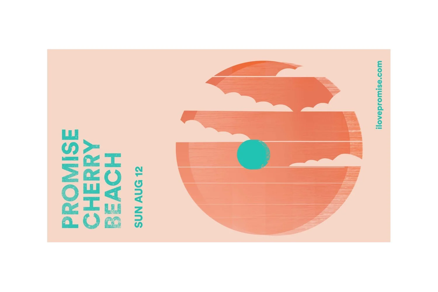
2018 marked a very special year for Promise. After 17 years of thoughtfully-curated musical experiences happening every Sunday at the special location Cherry Beach, it was time to take this party to the next level with a fully realized visual identity. An overarching main image for the 2018 season was created along with custom lineup and banners for each week, for fourteen consecutive weeks. Each week expressed a subtly shifting colour palette to reflect the changing sun and sky. The seasonal brand covered event signage, wristbands, social media assets, and gifs.
Client: Promise
Creative Director: Jordan St.Claire Snyder
Inspiration
Location is everything when setting the tone for a great gathering. It was important for Dave and Irving to highlight the unique feeling guests would experience at a Promise Cherry Beach party.
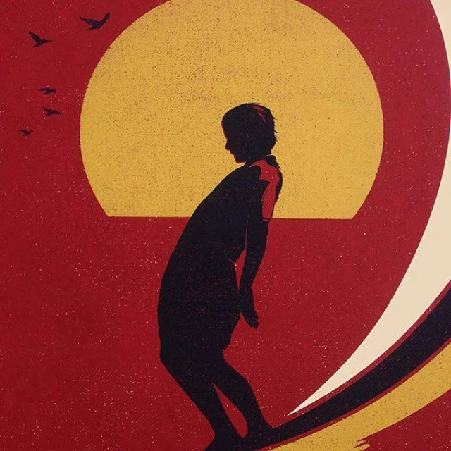
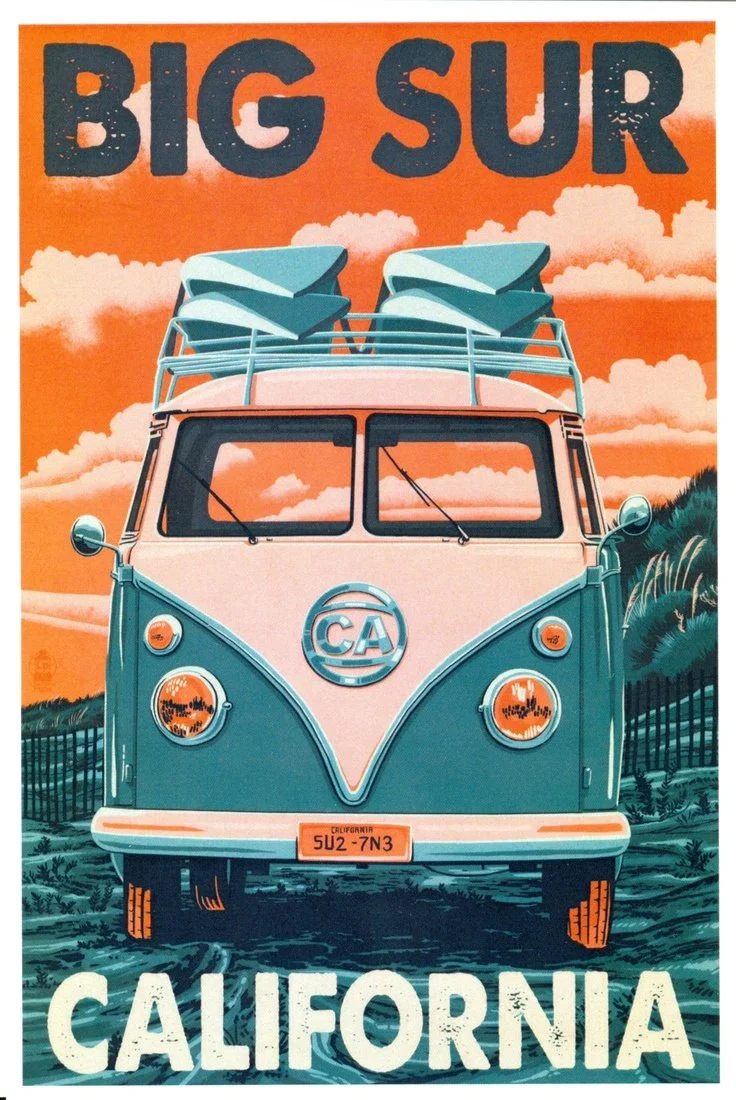
Vibrant colours, friendly appeal, and underground sensibility have always been the cornerstones of Promise branding. They came to the table with some ideas (70s surfer vibes, retro) and I returned with some inspiration to make sure we were on the same page before diving deep in to the graphics.

Main Season Imagery

The over-arching image of the season became an abstract interpretation of Cherry Beach. The type is stacked in the distance mimicking the factories and buildings of the city in the distance. I added movement to the clouds, sun, and water to recreate the dreamy feel one has at the event.
The inner circle, a cheeky nod to “cherry,” follows the sun’s natural path through the season.


Weekly Artist Line-ups

Weekly Event Banners