Tough Problems, Solved Visually.
Uncharted is a research and software development company that harnesses visual analytics to translate complex data into profound findings. Tackling problems such as human-trafficing, drought and famine, COVID-19 and HCI.
Uncharted had a logo, a business card, a powerpoint and no design system. When I came on they wanted to take what they had started and make it consistent not only in their parent brand, but also their products and research.
Client: Uncharted Software
Art Director: Jordan St.Claire Snyder
Senior Designer: Karol Borrero
Product Designer: Derrek Pennock
Junior Designer: Fiona Woo
-

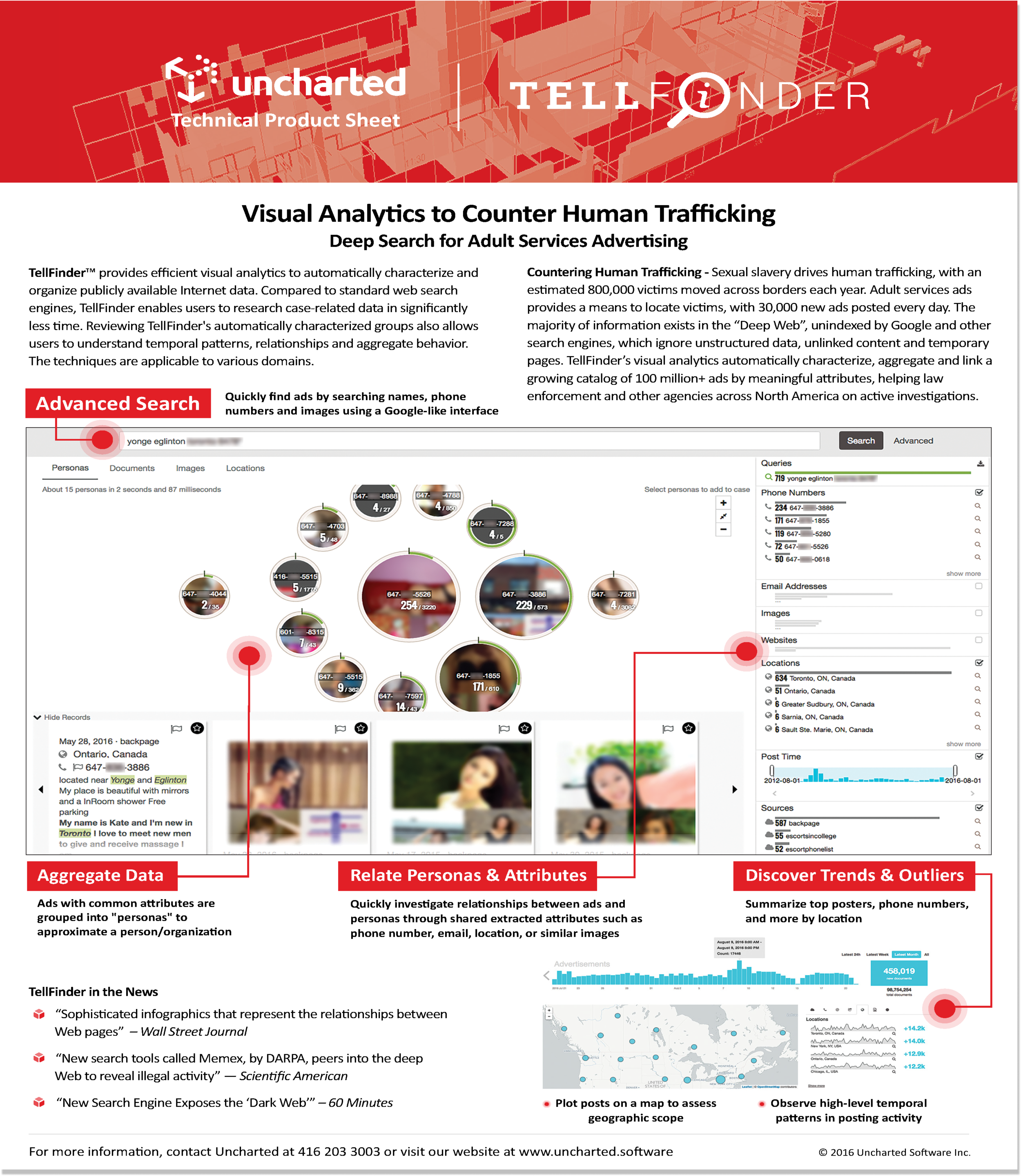
Before
The first step was doing a brand audit. Above is a map of all the different logos at Uncharted before the re-design. This is some of my research into what brand architecture made sense for Uncharted.
-

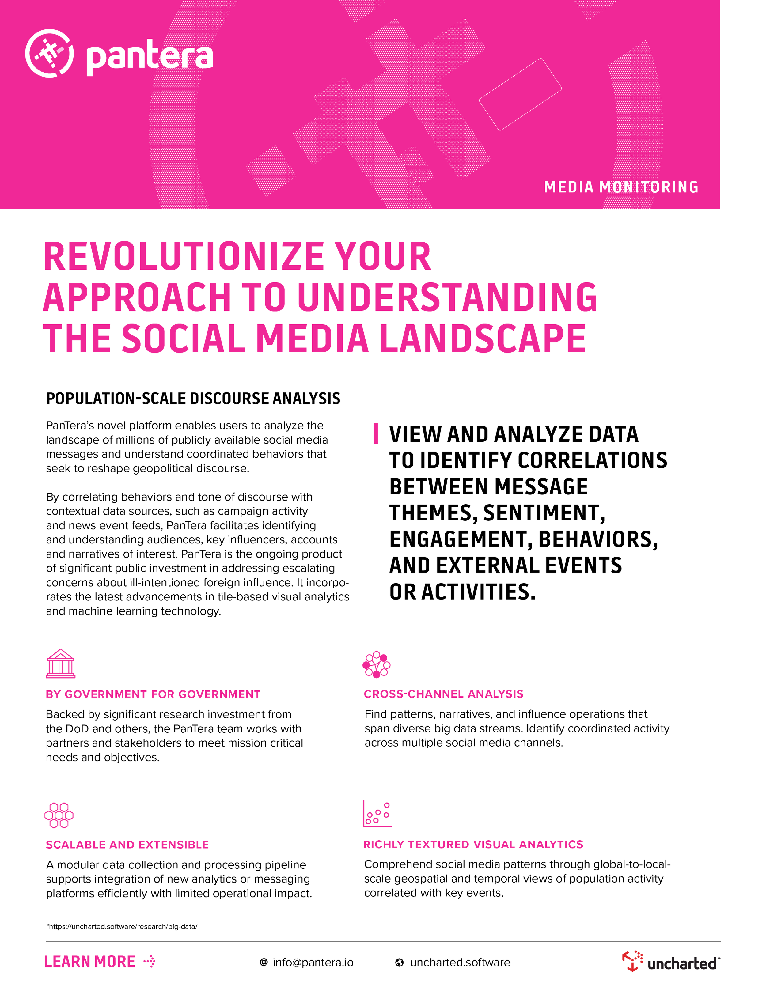
After
The goal was creating a suite of products that was easily recognised as belonging to Uncharted Software.
Taking stock of some of the characteristics that were working, I re-designed some of the logos using a new system that shared similar elements.
-

-

Expanding on the brand brought in new elements. From the dots in the icon we created a pattern to use. The many dots in an organised way is a visual representation on how Uncharted takes complex messy data and distills it down to organised and useful information.
Before Uncharted used blacks, blues and grays more than their brand colour, red. the team shifted and made the brand colour the focuus. Bold colours for bold innovations.
-

-

Uncharted Software works in many dimensions. We wanted to reflect that in how our brand icon was used in imagery. In digital work the icon is outlined, in printed work it is dotted, and in Meat Space it is solid.
Uncharted wanted to unify their many products into a suite in hopes to increase sales over all. Reviewing some of their designs we created characteristics that each logo would have so not only would they sit nicely next to each other, the customer would be able to identify them as products of Uncharted.
Before
Uncharted had many different ways of approaching imagery and icons with very little consistency or intention.
Based on the needs of the different product and marketing teams we broke down our imagery into product icons used for UX/UI, marketing icons for simple explanations, and illustrations for more abstract ideas.
We used unifying elements inspired by the Uncharted icon and product logos. The new style reflected Uncharted: professionals but approachable.
After


